Clinical Trials Analysis Tool Redesign

Learn how AstraZeneca used prototyping and usability testing to get real user feedback and redesign a key tool to be more intuitive and easier to use.

3 minute read

Clinical Trials Analysis Tool Redesign

The AstraZeneca UX team was asked to redesign the user interface for a key tool used to analyze clinical trials, called Real Time Analytics for Clinical Trials (REACT). REACT is part of the iDecide collaboration, a program between AstraZeneca, The Christie, Cancer Research UK and Manchester Cancer Research Centre to develop a suite of new technologies to support better clinical trials, both in terms of improved patient experience and efficiency of the trial process. The aim is to help AstraZeneca bring better new medicines to patients in need, more quickly.

The primary goal of the redesign was to improve usability, reduce the need for training, and better support the work process and users by delivering a more intuitive user interface. An agency was engaged to help plan and conduct user research, including interviews, co-design workshop and usability testing, plus the creation of a high fidelity prototype and style guide for the new UI.
Process

Plan

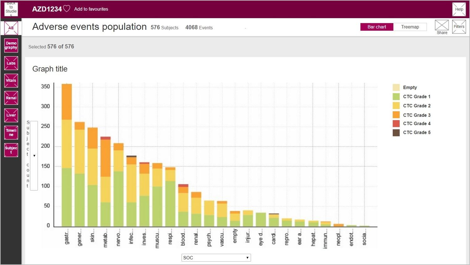
Through a series of user interviews and surveys, we uncovered specific unmet needs, pain points and potential opportunities for improvements to the REACT UI. With this understanding and initial feedback, we created an early prototype using Axure, a prototyping tool.

In planning the co-design workshop and usability testing, we identified 8 to 10 users from a cross-section of roles within clinical study teams (e.g. study physicians, study statisticians, patient safety scientists, medical scientists) so we could consider the different ways in which the tool is used. For the usability testing, we identified key task scenarios for users to complete so we could capture important design insights.

Conduct

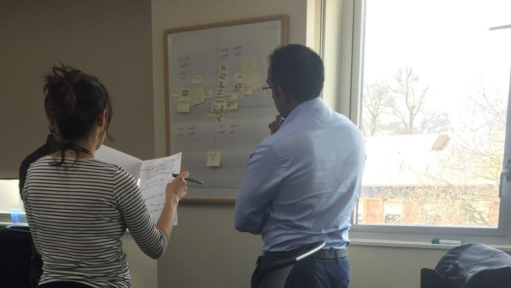
With the early prototype, we held a 2 day co-design workshop with users to review the early design, get immediate feedback, uncover additional requirements, and update the prototype on the spot. Following the creation of an iterated, higher fidelity Axure prototype, we conducted and recorded formal usability testing sessions (in-person and remotely) where 8 users were asked to perform key tasks and provide feedback using the latest version of the prototype. Those sessions were recorded and analyzed using Techsmith Morae.

Analyze and Report

Because the development team and key project team members were involved throughout the process of early research, prototyping and usability testing, we could make design decisions along the way without a lot of formal analysis and reporting.

Resulting UI changes and recommendations were delivered to the team via a high fidelity HTML prototype along with a UI style guide. User stories and requirements for new features and UI changes were also captured for the Agile development team to deliver within their development sprints.

Figure 1: REACT 2-day co-design workshop

Figure 1: REACT 2-day co-design workshop

Figure 2: REACT low fidelity prototype

Figure 2: REACT low fidelity prototype

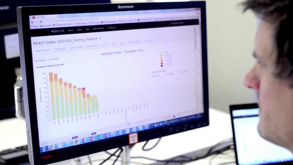
Figure 3: REACT final product

Figure 3: REACT final product

Outcome

By using a combination of user research, prototyping and usability testing, the new REACT user interface was very well received by users and resulted in a more effective analysis tool. User feedback highlights that that the new design delivers a significant improvement in terms of intuitiveness, usability and amount of training required. Quotes from REACT users include:

  • “Easily the most friendly version of REACT”
  • “Massively improved in terms of intuitiveness and usability”
  • “Overall, a great improvement. I’m impressed”

Additionally, user engagement from the project laid the groundwork for a user community for ongoing feedback and feature enhancement requests. And because the whole project team was involved in the process from the beginning, they could experience a user-centered design approach first-hand.